
Image Optimization
Image optimization is the process of reducing the number of bytes that represent an image. The smaller the image size, the faster it will load on a page. The smaller the image size, the less bandwidth it consumes. The less bandwidth it consumes, the better the experience for your users especially on mobile networks.
Responsive Images
Qwik supports responsive images.
This is a built-in feature that relies on the vite-imagetools module, so no additional packages or components need to be installed.
How it works
- Import any image from the
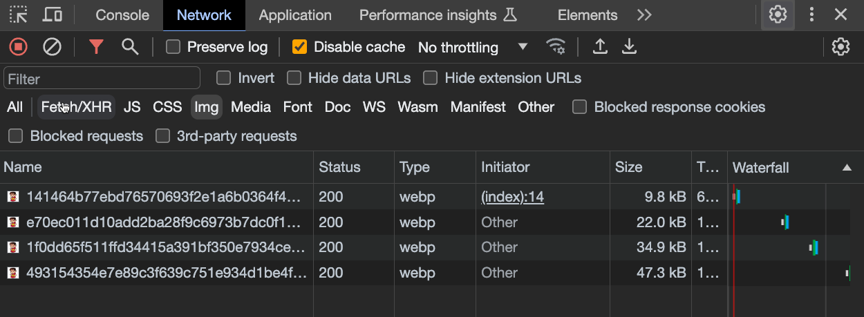
srcfolder - The image is converted in several webp images, one for each breakpoint (200px, 400px, 600px, 800px, 1200px)
- The image is processed and optimized to reduce its size
- An
<img>element is rendered, using thesrcsetattribute to set the image source for several resolutions - Now the browser will load the most suitable image for the resolution in use
Key Points
The community and the Qwik team love this API for a number of reasons:
- Zero runtime, zero JS
- Zero props by default, simple API
- Zero 404, strongly typed API
- Zero layout reflows (Automatic width/height)
- Hashed images, immutable cached
- Automatic
.webp/.avifformat optimization - Automated
srcSetgeneration - Extendable (use any
<img>attribute) - Loading lazy and async decoding by default
- Lightweight, a single
<img>node in the HTML
Usage
Add the ?jsx suffix at the end of the import
import Image from '[IMAGE_PATH]?jsx';Use the image in the template as a component:
<Image />Result
This script will generate the following <img> element:
<img

  decoding="async"
  loading="lazy"
  srcset="
    /@imagetools/141464b77ebd76570693f2e1a6b0364f4b4feea7 200w,
    /@imagetools/e70ec011d10add2ba28f9c6973b7dc0f11894307 400w,
    /@imagetools/1f0dd65f511ffd34415a391bf350e7934ce496a1 600w,
    /@imagetools/493154354e7e89c3f639c751e934d1be4fc05827 800w,
    /@imagetools/324867f8f1af03474a17a9d19035e28a4c241aa1 1200w"
  width="1200"
  height="1200"
>
decoding="async": indicates that the image will not block the rendering of the page while the image is being decoded. For further reference, please check the MDN web docs.loading="lazy": allows the browser to delay the loading of an image until it is visible in the viewport, which helps improve page loading performancesrcset: this attribute allows to choose the most appropriate image based on the device's screen size and resolutionwidthandheight: settingwidthandheightattributes prevents layout reflow, which hurts the CLS score
Note: You can also change the default behavior by manually setting the value of these properties:
<Image decoding="sync" loading="eager" />
Thanks to srcset attribute the browser will load the most suitable image for the device's resolution:
The original source size was 1.5Mb but its size is now just few kilobytes
Example
import { component$ } from '@builder.io/qwik';
import Image from '~/media/your_image.png?jsx';

export default component$(() => {
  return (
    <div>
      <Image />
    </div>
  );
});
Customize image width and height
You may need to set a custom width to the image:
<Image style={{ width: '300px'}} />but in that case you need to manually specify the height as well to avoid it being stretched:
<Image style={{ width: '300px', height: '200px'}} />Below you can see a simple trick to avoid having to manually set the height, while also maintaining the aspect ratio:
TIP: you should always specify
widthandheightvalues to prevent layout reflow
import { component$ } from '@builder.io/qwik';
import Image from '~/media/emote.png?jsx';

export default component$(() => {
  return (
    <>
      <h1>Image Example</h1>
      <div class="image-wrapper" >
        <Image />
      </div>
    </>
  );
});
.image-wrapper {
width: 300px; /* Set the desired width of the wrapper */
position: relative; /* Required for absolute positioning */
}
.image-wrapper img {
width: 100%; /* Make the image fill the width of its container */
height: auto; /* Let the browser calculate the height to maintain aspect ratio */
display: block; /* Remove any extra white space below the image */
}@unpic/qwik
- Site with detailed instructions on usage: @unpic/qwik
- Installation:
npm install @unpic/qwik
Unpic is a third-party image optimization library that works with existing image optimization CDNs. It provides an Image component that can be used to optimize images.
import { component$ } from '@builder.io/qwik';
import { Image } from '@unpic/qwik';

export default component$(() => {
  return (
    <Image
      src="https://cdn.shopify.com/static/sample-images/bath_grande_crop_center.jpeg"
      layout="constrained"
      width={800}
      height={600}
      alt="A lovely bath"
    />
  );
});Note: qwik-image and unpic are not a CDN and does not host your images. They work with existing image optimization CDNs. We suggest using some of the popular CDNs:
- Cloudinary
- Cloudflare
- Bunny.net
- Vercel / Next.js
- Imgix, including Unsplash, DatoCMS, Sanity and Prismic
- Shopify
- Kontent.ai
- Builder.io
- Contentful
- Storyblok
- WordPress.com and Jetpack Site Accelerator
qwik-image
Performant images with automatic optimization.
npm install qwik-image
or
yarn install qwik-image
or
pnpm install qwik-image
This is a pluggable component so devs could connect different image loaders to it (like builder.io or other CDNs)
import { $, component$ } from '@builder.io/qwik';
import {
  Image,
  type ImageTransformerProps,
  useImageProvider,
} from 'qwik-image';

export default component$(() => {
  const imageTransformer$ = $(
    ({ src, width, height }: ImageTransformerProps): string => {
      // Here you can set your favorite image loaders service
      return `https://cdn.builder.io/api/v1/${src}?height=${height}&width=${width}&format=webp&fit=fill`;
    }
  );

  // Global Provider (required)
  useImageProvider({
    // You can set this prop to overwrite default values [3840, 1920, 1280, 960, 640]
    resolutions: [640],
    imageTransformer$,
  });

  return (
    <Image
      layout="constrained"
      objectFit="fill"
      width={400}
      height={500}
      alt="Tropical paradise"
      placeholder="#e6e6e6"
      src={
        'image/assets%2FYJIGb4i01jvw0SRdL5Bt%2Fe5113e1c02db40e5bac75146fa46386f'
      }
    />
  );
});Here is the Github repository with detailed instructions on usage and customizations: qwikifiers/qwik-image
Contributors
Thanks to all the contributors who have helped make this documentation better!